 I learned that a general attitude and certain colours need to be included in my genre in order to seem asthetically professional production feel. The question I asked were leading but left open enough to allow peoples opinions. Without audience feedback I wouldnt have been able to understand peoples outlook on this genre of music and compared to official products the overall attitude seems like I have achieved this.
 Caswell's A2 media 4037
Thursday, 7 April 2011
Evaluation question 3
 I learned that a general attitude and certain colours need to be included in my genre in order to seem asthetically professional production feel. The question I asked were leading but left open enough to allow peoples opinions. Without audience feedback I wouldnt have been able to understand peoples outlook on this genre of music and compared to official products the overall attitude seems like I have achieved this.
 Wednesday, 6 April 2011
Evaluation Question 2
Evaluation Question 1
Thursday, 18 November 2010
Target audience responses and charts.
The advert is were I conducted most of my target audience research, as this is mainly what a large audience will see before video and single release. This advertises the release of the new album, here is an example of the questions I asked, and responses I got.


Monday, 25 October 2010
Animatic of storyboard
Monday, 20 September 2010
Digipak, Advert and moodboard
 This moodboard uses live images of the band, sohwing live aggression and their explosive energetic stage presence. I will use some of these images in the final piece along with my own images from Download 2010 where they headlined the saturday night of the festival.
 this is a draft for how I plan my digipak, the use of real images and google logos should help create a legitmate feel to my album cover and eventually help in creating a proffesional feel of the project. This will be the basis of my audience research and hopefully I will be able to use this to create a cover everybody likes and one that is suitable. So far I have had no Bad or construcitve feedback from my target audience, I hope there will be little changes made to what I have produced.
  The draft for my advert was simply a sketch that I scanned and uploaded. I showed this to a variety of people and they said that it was suitable. For results see target audience research graph examples for there feedback on the advert.

Here is my magazine advert. It follows the colour scheme for the band and presents the logo which is related to activism and freedom, also used by the mexican militant group the " Zapatista's during. The use of this logo creates a stir at first look as this is quite controversial, but upon further inspection its only a band logo. the font used also relates to attitude of the band as it is in a military stencil style and is plain and simple with little editing done. The advert states clearly the release of the album and who is releasing it and when, with clear understanding and obvious intentions this is a good magazine advert.
Thursday, 9 September 2010
RESEARCH: digipack deconstruction.


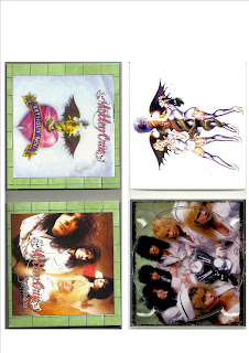
This Digipack is a typical display of a rock album, from a typical rock band Motley Crue, this band have set this ideal up of sex,drugs and rock and roll. The music and packaging instantly show this through the style of the digipack. The green tiles for the background, the title, the nurses all explain how the band have gone through a huge rehabillitation before the album release, yet still managing to make it rebellious through the nurses and tattoo artwork. The way this is done relates perfectly to the fanbase of Motley Crue, it shows a personal relationship between band and audience who may see themselves living a similar lifestyle. This creates a strong alliance and although the band have lived through drug addictions and alcholism, the fans may have too, therefore making a personal attachment to the characters of the band. This connection of personal identity can affect the sales, apperance and overall image of fans and the band, the uses and gratifications theory (blumler & Katz) relates to the idea that certain expectations that results to the audience gratifying personal choices. This digipack is a great example of personal identity change because of media, and personal opinion on rehabillitation. The women in the photos also will have a influence on the audience, seeing the picture will change there idea of an attractive woman, even though they are made up and suggestively positioned, the audience will assume that they need a woman like this or that the female audience should behave like this to get men in bands like Motley Crue.
Digipack 2. Tool - 10,000 days


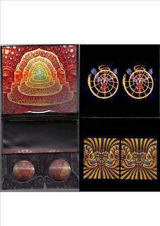
The contents of the digipack is not only a cd case, it involves the audience and is a great example of how suggestive media can influence the audiences way of thinking and way of seeing the world. The pack contains a booklet of images that you use the stereoscopic lenses provided to look at, the image appears 3d and life like. This exhibit of images and lenses shows how you can creatively see the world in a different way, Tool encourage this and the digipack enhances this. The audience experience is key in the marketing of this album, its not just perfect technical proggressive metal.In relation to the uses & gratification theory the audience have to be active and making active personal decisions on how their image can be improved thorugh the consumption of the media they feel that satisfies them. The combination of the music and this sequence of imagery creates a insight to how the band have forged there own specific audience. The personal relationship made between audience and band is one of enlightenment into seeing in different ways, in essence the lenses are how Tool link up themselves to the fans. The band have also notoriously experimented with psychadelic mind altering drugs such as LSD and DMT (diemethyltriptamine), an average Tool fan like me may not go too such extremes to enjoy there music, but Tool are open to experimentation of the sort and through this they are able to invite the audience into there chemical experiences through anatomical images and pyschadelic visions. Personally the album has changed my outlook and opinions on the use of LSD and alternative states of consciousness , Tool benefited and are able to express this and create artwork such as this album. There way of life and thinking is personified through this digipack.